Transform 21: Practical Seismic in Python
Graeme Mackenzie & Jørgen Kvalsvik
Introduction
During this tutorial we are going to demonstrate how to read in a 4D base and monitor volume using 2 different python packages, plot some lines and slices interactively then calculate some simple 4D attributes (4D difference and NRMS) and apply a frequency filter to the data.
Video Recording
The corresponding livestream and resultant video can be found here on YouTube. Note that the livestream is about 20-30 seconds behind us!
Requirements
Python Packages
In addition to the standard packages we will need
- segyio
- seismic-zfp
- scipy
- holoviz
If you are using Anaconda these can be installed using:
conda install segyio scipy
conda install -c pyviz holoviz
pip install seismic-zfp
Or use the environment.yml file in the GitHub repository.
If you are using python for windows these will all need to be installed through pip install. However it is much easier to install holoviz using Anaconda (if you are using pip you will likely need to download and install the individual whl files)
Data
We are going to use 2 volumes from the Volve data which has been published by Equinor. You can read about it here and download the data here
We will use data from the 4D processing of the ST0202 and ST10010 surveys which are in the ST0202vsST10010_4D sub directory
- ST0202ZDC12-PZ-PSDM-KIRCH-FULL-T.MIG_FIN.POST_STACK.3D.JS-017534.segy
- ST10010ZDC12-PZ-PSDM-KIRCH-FULL-T.MIG_FIN.POST_STACK.3D.JS-017534.segy
Instructions for downloading the data using Azure Storage Explorer are provided on the download link but we can also download the SEG-Ys using the azure cli and the code in the cells below
You will need to get a shared access token from the Volve data webpage as illustrated in the image below.

# # to download the SEG-Ys from volve we use the azure cli
# import sys
# !{sys.executable} -m pip install azure-cli
import sys
import os
# The shared access signature URI can be found on the Volve download page. The token is the stuff after ?, should be sv=<date>&sr=<sr>...
sastoken = 'sv=2018-03-28&sr=c&sig=wvS%2Fe3ib%2BXhNcLWikP2oZ9It9x33OMegak12sKUamJQ%3D&se=2022-05-05T15%3A49%3A07Z&sp=rl'
if not os.path.exists('ST10010.segy'):
!{sys.executable} -m azure.cli storage blob download \
--account-name datavillagesa \
--container-name volve \
--name "Seismic/ST0202vsST10010_4D/Stacks/ST10010ZDC12-PZ-PSDM-KIRCH-FULL-T.MIG_FIN.POST_STACK.3D.JS-017534.segy" \
--file "ST10010.segy" \
--sas-token "{sastoken}"
if not os.path.exists('ST0202.segy'):
!{sys.executable} -m azure.cli storage blob download \
--account-name datavillagesa \
--container-name volve \
--name "Seismic/ST0202vsST10010_4D/Stacks/ST0202ZDC12-PZ-PSDM-KIRCH-FULL-T.MIG_FIN.POST_STACK.3D.JS-017534.segy" \
--file "ST0202.segy" \
--sas-token "{sastoken}"def cleanup():
"""
Run this to have the notebook clean up after itself. It is not run automatically.
"""
import os
os.remove('ST0202.segy')
os.remove('ST10010.segy')
os.remove('ST10010.sgz') # We'll create this file during the tutorialBasic Imports
We'll start with importing some packages;
import numpy as np
import segyio
import matplotlib
import matplotlib.pyplot as plt
from matplotlib.offsetbox import AnchoredText
# Set the default plot size for matplotlib figures
matplotlib.rcParams['figure.figsize'] = (11.75, 8.5)Reading the Volve 2002 base survey using segyio
We will read the base 2002 survey using segyio
base_segy = 'ST0202.segy'Let's check the EBCDIC to see that we have the data we are expecting
f = segyio.open(base_segy, ignore_geometry = True)
segyio.tools.wrap(f.text[0])
'C01 CLIENT : STATOIL PROCESSED BY: WESTERNGECO\nC02 AREA : VOLVE, BLOCK 15/9, NORTH SEA - ST0202 SURVEY: 3D 4C 0BC\nC03 4D POST-STACK FINAL PSDM DATE: 2012-03-30\nC04 DATA FORMAT: SEGY DATA TYPE: STACK-FULL ANGLE, 3-41 DEGREES (T)\nC05 ---------------------AQUISITION PARAMETRS----------------------------------\nC06 DATA SHOT BY VESSEL: M/V GECO ANGLER & WESTERN INLET CABLE LENGTH:6100 M\nC07 NO OF GROUPS: 960/P,X,Y,Z. NO OF CABLES: 2 ARRAY VOL/SOURCE: 2250 CU IN.\nC08 GROUP INTERVAL: 25M SHOT INTERVAL: 25M (FLIP-FLOP)\nC09 GEODECTIC DATUM: ED50 SPHEROID: INTERNAT 1924. PROJECTION: UTM\nC10 UTM ZONE: 31 N\nC11 RECORD LENGTH: 10000 MS SAMPLE INTERVAL: 2 MS\nC12 NAVIGATION SOURCE P1/90 UKOOA, SPS\nC13 ----------------------PROCESSING SEQUENCE----------------------------------\nC14 REFORMAT, RESAMPLING TO 4MS, NAV/SEISMIC DATA MERGE\nC15 Z TO P AMP. MATCH & DESIGNATURE,TIDAL STATIC CORRECTION, NOISE ATTENUATION\nC16 PZ CALIBRATION & SUMMATION, DIRECT ARRIVAL REMOVAL (SHOT & RECEIVER DOMAIN)\nC17 LINEAR NOISE ATTENUATION (RECEIVER DOMAIN),\nC18 SELECTIVE RANDOM NOISE ATTENUATION (SHOT DOMAIN)\nC19 LOW VELOCITY COHERENT NOISE MODEL AND SUBTRACTION\nC20 5HZ LOW CUT FILTER, GLOBAL DEBUBBLE OPERATOR APPLIED\nC21 SINGLE BOUNCE DECON IN TAU-P DOMAIN AND DWD MULTIPLE MODEL AND SUBTRACTION\nC22 OFFSET REGULARIZATION, TIME LAPSE BINNING, TRACE BORROWING, PrSDM\nC23 DEPTH TO TIME CONVERSION, RESIDUAL VELOCITY ESTIMATION AND APPLICATION\nC24 ANGLE MUTE (3-41 DEGREES), STACK, INVERSE_Q (100)\nC25 RANDOM NOISE ATTENUATION, BPF 5Hz 18dB/OCT LOW-CUT\nC26 12.5X12.5 INTERPOLATION, OUTPUT SEGY FORMAT\nC27 ----------------------DATA LENGTH AND SAMPLING-------------------------\nC28 FIRST SAMPLE: 4 MS LAST SAMPLE: 3400 MS SAMPLE INTERVAL: 4 MS\nC29 ----------------------PROCESSING GRID INFORMATION-------------------------\nC30 INLINE BIN SIZE: 12.5M CROSSLINE BIN SIZE: 12.5M AZIMUTH: 284 DEGREES\nC31 INLINE NUMBER INCREMENT:1 CROSSLINE NUMBER INCREMENT:1\nC32 PG1 X: 439272.97 Y: 6475068.89 IL: 9961 XL: 1881\nC33 PG2 X: 429582.21 Y: 6477485.37 IL: 9961 XL: 2680\nC34 PG3 X: 440588.57 Y: 6480344.84 IL: 10396 XL: 1881\nC35 PG4 X: 430897.81 Y: 6482761.32 IL: 10396 XL: 2680\nC36 ----------------------HEADER WORD POSITIONS--------------------------------\nC37 CMP BYTES 21-24 | 3D INLINE BYTES 189-192 | 3D CROSS LINE BYTES 193-196\nC38 BIN CENTRE UTM-X BYTES 181-184. | BIN CENTRE UTM-Y BYTES 185-188\nC39 ALL COORDINATE VALUES ARE MULTIPLIED BY 100\nC40 END EBCDIC'print(segyio.tools.wrap(f.text[0]))The EBCDIC shows the first live sample should be at 4ms - let's check segyio is picking that up correctly
f.samples[:5]segyio is picking up the samples correctly and from the EBCDIC it looks like it is a regular volume, so let's try to read the file
with segyio.open(base_segy) as segyf:
    n_traces = segyf.tracecount
    sample_rate = segyio.tools.dt(segyf)
    n_samples = segyf.samples.size
    n_il = len(segyf.iline)
So it seems the data is not as regular as we thought. Let's look into the data in more detail.
f = segyio.open(base_segy, ignore_geometry = True)
ntraces    = len(f.trace)
inlines    = []
crosslines = []

for i in range(ntraces):
    headeri = f.header[i]
    inlines.append(headeri[segyio.su.iline])
    crosslines.append(headeri[segyio.su.xline])

print(f'{ntraces} traces')
print(f'first 10 inlines: {inlines[:10]}')
print(f'first 10 crosslines: {crosslines[:10]}')
The loop variable i is only used to look up the the right header, but segyio can manage this for us
inlines = []
crosslines = []
for h in f.header:
    inlines.append(h[segyio.su.iline])
    crosslines.append(h[segyio.su.xline])

print(f'{ntraces} traces')
print(f'first 10 inlines: {inlines[:10]}')
print(f'first 10 crosslines: {crosslines[:10]}')
# Plot the inline and crossline as a scatter plot
plt.scatter(crosslines, inlines, marker="s", s=1)We can tell from the top-left and bottom-right corner that there are a few traces missing, and the file is not a perfect cube.
Using a scatter plot works because the file is small enough - with very large files this becomes impractically slow to run, and likely impossible to see, but it's a good trick for a lot of files.
We can approach it more programmatically to understand precisely what is missing.
import itertools
uniqil = set(inlines)
uniqxl = set(crosslines)
real = set(zip(inlines, crosslines))
grid = set(itertools.product(uniqil, uniqxl))
missing = grid - real
missing
To continue, we need to check if the line numbers are regularly spaced
plt.plot(inlines)plt.plot(crosslines[:5000])Plotting is good for eyeballing and catching some obviously disorganised files, but it does not give too much confidence, because small errors are difficult to spot.
We want to fill out the missing traces and create a regular volume. We start by determining the interval of inlines and crosslines.
import numpy as np
ils = np.unique(inlines)
xls = np.unique(crosslines)
inline_interval    = ils[1:] - ils[:-1]
crossline_interval = xls[1:] - xls[:-1]
print(inline_interval)
print(crossline_interval)
This file is obviously all regular and with a neat delta 1. Here you might need to make some choices should the interval be very irregular, but for this file we are good.
We now need to put every trace in the right place, which means we need to map in/crossline pairs to the right offset in our target array. Had no traces been missing, this is what segyio figures out by default.
Note: There are faster approaches, but this is fairly straight forward to read and write.
ils = sorted(uniqil)
xls = sorted(uniqxl)
lineindex = {
    (il, xl): i
    for i, (il, xl) in enumerate(sorted(grid))

}
lineindex
d = np.zeros((len(ils), len(xls), len(f.samples)))
lineard = d.reshape(d.shape[0] * d.shape[1], d.shape[2])
for il, xl, trace in zip(inlines, crosslines, f.trace[:]):
lineard[lineindex[il, xl]][:] = trace[:]Data is in a 3D numpy array and our inline, crossline and twt are also in separate numpy arrays
d.shapePlotting the data
As geophysicists one of the first things we want to do once we've loaded some data is to view it. We're going to use Matplotlib to vizualize a single (central) inline
# Set up some aliases
ilines = np.array(sorted(uniqil))
xlines = np.array(sorted(uniqxl))
t = np.array(f.samples)

# Estimate the amplitude range to use for the plots by taking the 95th percentile

vm = np.percentile(d, 95)
print(vm)

# Define the central line
central = len(ilines) // 2
# Plot
plt.imshow(d[central,:,:], cmap='gray', aspect='auto', vmin=-vm, vmax=vm)
plt.show()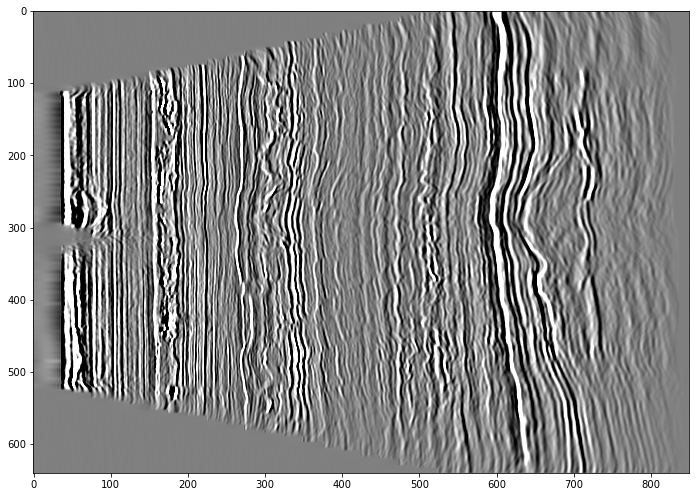
We can see that it's definitely seismic but not oriented how we would expect.
When using any plotting packages in Python we need to consider the origin and how the data is read. Matplotlib assumes the origin is in the top right corner (which is fine for a section but possibly not what we would want if plotting a time slice) and it is plotting the trace along the x-axis. We need to transpose the array so it plots with the time on the y-axis
The axis labels aren't really meaningful to us so we also need to read the arrays containing the travel time and xline numbers and add these to the plot as labels.
extent = [xlines[0], xlines[-1], t[-1], t[0]]

# Plot the central inline in the usual orientation by transposing the data

plt.imshow(d[central,:,:].T, cmap='gray', aspect='auto', vmin=-vm, vmax=vm, extent=extent)

plt.xlabel('Xline')
plt.ylabel('TWT (ms)')
plt.title('ST0202 INL'+ str(ilines[central]))
plt.show()
Note that whilst Matplotlib has the origin for the plot at the top right, the extent is coded as (left, right, bottom, top) (see here for more details on origins and extents in matplotlib.)
We can also plot a slice, in this case we don't need transpose the data, but we have changed the origin to the bottom left
# Central time slice

tmid = len(t)//2

extent = [xlines[0], xlines[-1], ilines[0], ilines[-1]]

plt.imshow(d[:,:,tmid], cmap='gray', origin='lower', aspect='auto', vmin=-vm, vmax=vm, extent=extent)

plt.xlabel('CRL')
plt.ylabel('INL')
plt.title('ST0202 Time Slice '+ str(t[tmid])+'ms')
plt.show()
Interactive plotting
Ideally we would like the plots to be a bit more interactive, so we could zoom in on an area of interest or quickly scan through some lines, rather than having to edit the code above and rerun the cell above multiple times.
We're going to use the advance plotting options of hvplot and panel to create an interactive plot. The libraries we are going to use are all grouped and maintained together under the HoloViz ecosystem
import xarray as xr
import hvplot.xarray
import panel as pn
# Set the default image size
from holoviews import opts
opts.defaults(
opts.Image(
width=800, height=600))# Define a plotting function, the input will be the inline
def plot_inl(inl):
"""
Plot a single inline using hvplot
"""
idx = inl - ilines[0]
da = xr.DataArray(d[idx,:,:].T)
p = da.hvplot.image(clim=(-vm, vm), cmap='gray', flip_yaxis=True)
return pplot_inl(ilines[central])# Use panel to pass an array of ilines to the function
pn.interact(plot_inl, inl = ilines)The widget class in panels provides a range of widgets for the data selection (sliders, player, checkboxes, auto-complete text-field, .....)
Here we will use a drop down menu which is a little more useful for line selection.
line_select = pn.widgets.Select(name='INL Selection', options=ilines.tolist())

pn.interact(plot_inl, inl = line_select)
Using Xarray
As with our original plot using Matplotlib the interactive plots we created above have no useful axis info.
In the plot_inl function we had to convert our NumPy array into an DataArray in order to allow us to plot it with hvplot. However, Xarray has a lot more useful functionality that makes it ideal for using with seismic data. Xarray simplifies working with multi-dimensional data and allows dimension, coordinate and attribute labels to be added to the data (segysak utilises it and Tony's tutorial on Tuesday provided some more information on the format).
Xarray has two data structures
- DataArray: for a single data variable
- DataSet: a container for multiple Data Arrays that share the same coordinates
The figure below (Hoyer & Hamman, 2017) illustrates the concept of a dataset containing climate data

#Create a Data Array
da = xr.DataArray(data = d,
                  dims = ['il','xl','twt'],
                  coords = {'il': ilines,
                          'xl': xlines,
                          'twt': t})
# Take a look
daWe now have our inline, crossline and travel time held as coordinates within inside the same array as the data itself.
This allows us to select data either using the standard NumPy numerical indexing and slicing or using xarray's .sel label based indexing, allowing us to select data based on the coordinate.
da.sel(twt = 3000)da[:,:,749]# To select a range we use slice
da.sel(twt = slice(2000,3000))We've converted the 2002 seismic into a DataArray, but as we're going to be reading another vintage, it's useful to convert it into a DataSet which we can add the 2010 monitor survey into.
We'll also add some attribute information both to the data array and the dataset
# Add some attribute information to the datarray
da.attrs['Year'] = '2002'
da.attrs['Type'] = 'Final PSDM time converted'

# Create a dataset
volve_ds = da.to_dataset(name = 'base')

# Add some attribute information to the dataset
volve_ds.attrs['Country'] = 'Norway'
volve_ds.attrs['Field'] = 'Volve'

# Take a look
volve_ds
Getting data from the Xarray dataset is similar to a python dictionary key and value
# Extract a line from the base survey
volve_ds['base'].sel(il = 9963)Reading the Volve 2010 monitor survey using seismic-zfp
Now we've read and reviewed one vintage, let's read the second
Another option for reading SEG-Y into Python is to use SEGY-SAK which Tony Hallam gave a tutorial on earlier this week, and which leverages segyio. Here we'll use a third option and convert the segy file into another format. We will use seismic-zfp which converts the SEG-Y to a compressed format Wade, 2020. We won't go into detail on this format but examples can be found on Github.
from seismic_zfp.conversion import SegyConverter, SgzReaderConversion from segy to seismic-zfp format
The first step is to convert the file.
monitor_segy = 'ST10010.segy'
monitor_sgz = 'ST10010.sgz'
# Create a "standard" SGZ file with 8:1 compression, using in-memory method
with SegyConverter(monitor_segy) as converter:
converter.run(monitor_sgz, bits_per_voxel=4)Read seismic-zfp
Now it's converted we can read it
# Quickly review the EBCDIC header
with SgzReader(monitor_sgz) as reader:
    ebc = reader.get_file_text_header()

# This returns a byte array so let's decode it to a string
ebc[0].decode()
# Read the cube from zgy
with SgzReader(monitor_sgz) as reader:
n_traces_m = reader.tracecount
n_il_m = reader.n_ilines
n_xl_m = reader.n_xlines
num_samples_m = reader.n_samples
ilines_m = reader.ilines
xlines_m = reader.xlines
data_m = reader.read_volume()
print(f'sgz file with {n_traces_m} traces ({n_il_m} inlines, {n_xl_m} xlines) read')With seismic-zfp we have the initial overhead of converting the file, but then reading the sgz file may take less time than segyio. Whether you use segyio, seismic-zfp or segysak comes down a lot of things; how often will you read the file, are the headers critical, is the compression important, personal preference,.....
Now we've read the monitor survey, let's quickly check they are both the same shape and have the same inline, crossline range
# Shape of arrays
print(f'2002 base survey has shape {d.shape}')
print(f'2010 monitor has shape {data_m.shape}')
# Line ranges
print(f'Base survey; inline: {ilines.min()} - {ilines.max()}, crossline: {xlines.min()} - {xlines.max()}')
print(f'Monitor survey; inline: {ilines_m.min()} - {ilines_m.max()}, crossline: {xlines_m.min()} - {xlines_m.max()}')
Plot a slice of both volumes as a quick qc
base    =      d[:, :, 75]
monitor = data_m[:, :, 75]


fig, axs = plt.subplots(1,2, figsize=(16,6))

extent = [xlines[0], xlines[-1], ilines[0], ilines[-1]]
plt_kwargs = {'cmap':'gray', 'origin':'lower', 'aspect':'auto', 'vmin':-vm, 'vmax':vm, 'extent':extent}

# The plt_kwargs replaces the various plotting options (suc as colour map etc) that are going to be common to both plots
# Without it we would use a command similar to this
#axs[0].imshow(base, cmap='gray', origin='lower', aspect='auto', vmin=-vm, vmax=vm, extent=extent)

axs[0].imshow(base, **plt_kwargs)
axs[0].set_title('2002 Base, Time Slice')
axs[1].imshow(monitor, **plt_kwargs)
axs[1].set_title('2010 Monitor, Time Slice')
plt.tight_layout()
plt.show()
Now we've quickly QC'd the monitor survey and satisfied ourselves that it is the same size and shape as and looks very similar to the base let's add it to the Xarray DataSet.
da2 = xr.DataArray(data_m)
da2.attrs['Year'] = '2010'
volve_ds['monitor'] = (['il','xl','twt'], da2.data)volve_ds5 MINUTE BREAK

4D Analysis
Now we have the 2 volumes we can calculate some simple 4D attributes
- Calculate the 4D difference
- Calculate the NRMS
4D Difference
The 4D difference is simply the monitor survey minus the base survey
# The difference of two arrays diff = volve_ds['monitor'] - volve_ds['base']
# This will create a new array diff
#
# When we read in the monitor survey we firstly read it into a numpy array then added it to the xarray.
# Here we will add the difference directly to the volve_ds dataset

volve_ds['difference'] = (['il','xl','twt'], volve_ds['monitor'].data - volve_ds['base'].data)
Now we can plot the difference; here we'll create a plot with a drop down selection to either view the base, monitor or difference
# Set up a dictionary for our data selection panel

seismic = {}

seismic['Base']          = volve_ds['base']
seismic['Monitor']       = volve_ds['monitor']
seismic['4D Difference'] = volve_ds['difference']

# Define the plotting functions

def plot_line_compare(inl, volume):
    da = seismic[volume].sel(il=inl)
    p = da.hvplot.image(clim=(-vm,vm), cmap='gray', flip_yaxis=True, invert=True)
    return p

def plot_slice_compare(t, volume):
    da = seismic[volume].sel(twt=t)
    p = da.hvplot.image(clim=(-vm,vm), cmap='gray')
    return p
line_sel = pn.widgets.Select(name='INL Selection', options=volve_ds.coords['il'].values.tolist())
pn.interact(plot_line_compare, inl=line_sel, volume=seismic.keys())#t_sel = pn.widgets.Select(name='TWT', options=volve_ds.coords['twt'].values.tolist())
t_sel = volve_ds.coords['twt'].values.astype(int)
pn.interact(plot_slice_compare, t=t_sel, volume=seismic.keys())NRMS
It's pretty difficult to see where the genuine 4D signal is. A standard 4D QC is NRMS (Kragh and Christie, 2002) which is a measure of similarity between two traces (from 0 - 200%).
where RMS is :
Ideally the NRMS value should be as low as possible above the reservoir where there should be no difference.
Kragh, E. and Christie, P. (2002) Seismic repeatability, normalized RMS, and predictability. The Leading Edge, 21, 640-647, http://dx.doi.org/10.1190/1.1497316
# Define the functions we need to calculate NRMS
# NRMS = 200 x [rms (b-m) / rms(b) + rms(m)]

def rms (data):
    """
    Calculate the RMS
    """
    rms = np.sqrt(np.mean(data**2, axis=2))
    return rms

def nrms (monitor, base):
    """
    Calculate the NRMS between 2 surveys
    """
    rmsB = rms(base)
    rmsM = rms(monitor)
    diff = monitor - base
    rms_diff = rms(diff)
    nrms = 200 * (rms_diff / (rmsB + rmsM))
    return nrms
# Calculate the NRMS and add to the xarray
volve_ds['nrms_1_2'] = (['il','xl'], nrms(volve_ds['monitor'].sel(twt=slice(1000,2000)), volve_ds['base'].sel(twt=slice(1000,2000))))
volve_ds['nrms_2_3'] = (['il','xl'], nrms(volve_ds['monitor'].sel(twt=slice(2000,3000)), volve_ds['base'].sel(twt=slice(2000,3000))))
# Review the dataset
volve_ds# Get some statistics
mean1 = volve_ds['nrms_1_2'].mean().values
mean2 = volve_ds['nrms_2_3'].mean().values
print(f'Mean NRMS 1000-2000ms: {mean1}')
print(f'Mean NRMS 2000-3000ms: {mean2}')# Plot the NRMS as histograms
fig, axs = plt.subplots(1,2, figsize = (11,6), sharex=True, sharey=True)
# Flatten the arrays
x1 = volve_ds['nrms_1_2'].values.flatten()
x2 = volve_ds['nrms_2_3'].values.flatten()
# Bin the NRMS values in a range 0,100 with 100 bins and plot the histograms
im1 = axs[0].hist(x1, 100, range=[0,100])
im2 = axs[1].hist(x2, 100, range=[0,100])
# Add some statistics (utilising panda.describe())
anchored_text0 = AnchoredText(str(volve_ds['nrms_1_2'].to_dataframe().describe()), loc=1)
axs[0].add_artist(anchored_text0)
anchored_text1 = AnchoredText(str(volve_ds['nrms_2_3'].to_dataframe().describe()), loc=1)
axs[1].add_artist(anchored_text1)
# Add some titles
axs[0].set_title('NRMS 1000-2000ms')
axs[1].set_title('NRMS 2000-3000ms')
plt.tight_layout()
plt.show()# Plot the NRMS maps
fig, axs = plt.subplots(1,2, figsize = (16,8))
# Define the map extent and common plotting parameters
extent = [xlines[0], xlines[-1], ilines[0], ilines[-1]]
plt_kwargs = {'cmap':'viridis_r', 'origin':'lower', 'aspect':'auto', 'extent':extent}
# Plot the shallow window
im1=axs[0].imshow(volve_ds['nrms_1_2'], **plt_kwargs, vmin=5, vmax=35)
axs[0].set_title('NRMS 1000-2000ms')
fig.colorbar(im1, ax=axs[0], orientation='horizontal', pad=0.06)
# Plot the deeper window
im2=axs[1].imshow(volve_ds['nrms_2_3'], **plt_kwargs, vmin=5, vmax=18)
axs[1].set_title('NRMS 2000-3000ms')
fig.colorbar(im2, ax=axs[1], orientation='horizontal', pad=0.06)
# Add a title to the figure
fig.suptitle('NRMS', size='xx-large', va='bottom')
plt.tight_layout()
plt.show()Frequency spectra and filtering
Frequency spectra
The 4D QC's showed the data has a lot of 4D noise. Let's take a look at the frequency spectra.
Both the NumPy and SciPy packages have the ability to run an fft, here we are using NumPy but we could equally have used SciPy.
# Define a basic function to calculate frequency spectra
# As we are using an fft we should really taper or window the data to prevent edge effects,
# but for this demonstration we are going to conveniently ignore this

# An FFT returns a vector of complex values, in this case we are using the RFFT option to just return the real values

def fspectra(data, dt = 4):
    """
    Calculate the frequency spectra
    """
    # Amplitude values

    # Get the absolute value of the Fourier coefficients
    fc = np.abs(np.fft.rfft(data, axis = -1))

    # Take the mean to get the amplitude values of the spectra
    a = np.mean(fc, axis = (0, 1))

    # Get the frequency values corresponding to the coefficients
    # We need the length of the window and the sample interval in seconds

    dts = dt / 1000
    length = data.shape[-1]

    f = np.fft.rfftfreq(length, d = dts)

    return f, a
# Calculate the amplitude spectra of the base and monitor from 1.5 - 2.5 seconds
freq, ampb = fspectra(volve_ds['base'].sel(twt=slice(1500,2500)))
_, ampm = fspectra(volve_ds['monitor'].sel(twt=slice(1500,2500)))
# Plot the frequency spectra
plt.figure(figsize = (11,6))
plt.plot(freq, ampb, color='r')
plt.plot(freq, ampm, color='b')
plt.xlabel('Frequency (Hz)')
plt.ylabel('Amplitude')
plt.legend(labels = ['Base','Monitor'])
plt.title('Amplitude spectra')
plt.show()Frequency filter
There's a very small difference between the two vintages and possibly some noise above 40Hz, so let's apply a high cut filter
We're going to use the signal processing options of SciPy
in a 2 step process; firstly to generate a filter and then to apply the filter.
from scipy import signal# Generate a lowpass/highcut filter
# Firstly we'll define the Nyquist frequency
fs = 1 / 0.004
nyq = fs / 2
# We're going to generate a simple butterworth filter,
# The order (in this example we've used 7) determines the slope, larger is a steeper slope
# The cutoff is the -3dB point and is given as a fraction of the nyquist frequency
fcut = 40
cutoff = fcut / nyq
hc_filt = signal.butter(7, cutoff, btype='lowpass', output='sos')# Plot the response of the filter
# The response is given angular freq (w), normalized to [0, pi] and amplitude (h)
w, h = signal.sosfreqz(hc_filt)
# Convert to frequency
# w_max / pi = nyq
freq = nyq * w / np.pi
# Plot
plt.figure(figsize = (8,6))
plt.plot(freq, np.abs(h), 'b') #plot the response
plt.axvline(fcut, color='k', ls='--') #plot the high cut frequency as a dashed black line
plt.plot(fcut, 1/np.sqrt(2), 'ko') #plot the -3dB (1/sqrt(2)) point as a black circle
plt.xlim(0, nyq)
plt.xlabel('Frequency (Hz)')
plt.title('Filter response')
plt.show()# Apply the filter
volve_ds['base_hc40'] = (['il','xl','twt'], signal.sosfiltfilt(hc_filt, volve_ds['base'], axis=2))# Calculate the amplitude spectra of the filtered base survey
f, ampf = fspectra(volve_ds['base_hc40'].sel(twt=slice(1500,2500)))
# Plot the frequency spectra
plt.figure(figsize=(11,6))
plt.plot(f, ampb, color='r')
plt.plot(f, ampf, color='b')
plt.xlabel('Frequency (Hz)')
plt.ylabel('Amplitude')
plt.legend(labels = ['Base','Base after High Cut'])
plt.title('Amplitude spectra')
plt.show()A standard QC we want for any geophysical process is before, after and a difference plot. We'll use the interactive plotting method we used to view the 4D difference but this time, rather than calculating the difference in advance, we'll do it on the fly.
# Interactive plot with before, after and difference
# Set up a dictionary for our data selection panel

seismic = {}
seismic['before']     = volve_ds['base']
seismic['filter']     = volve_ds['base_hc40']
seismic['difference'] = volve_ds['base_hc40'] - volve_ds['base']

# Define out plotting function

def plot_compare(inl, volume):
    da = seismic[volume].sel(il=inl)
    p = da.hvplot.image(clim=(-vm,vm), cmap='gray', flip_yaxis=True, invert=True)
    return p
line_sel = pn.widgets.Select(name='INL Selection', options=volve_ds.coords['il'].values.tolist())
pn.interact(plot_compare, volume=seismic.keys(), inl=line_sel)If we had more time we could obviously now filter the monitor survey and re-calculate the 4D difference and NRMS
# Uncomment and run the cleanup function to remove the segy and sgz files if desired

#cleanup()
Additional Resources
This tutorial aimed to give a geophysicist relatively new to Python a brief overview on how to read and view a SEGY dataset and run some simple processing and some of the packages that are available to them.
There are a number of additional resources with notebooks providing further examples, two useful locations are:
oneseismic Demonstration
Thanks
We hope this tutorial has taught you some new tips and/or provided you with a basic introduction to help you start using Python to work with seismic data.
Feel free to ask any follow up questions or start a conversation in our slack channel t21-thurs-practicalseismic.
- Kragh, E., & Christie, P. (2002). Seismic repeatability, normalized rms, and predictability. The Leading Edge, 21(7), 640–647. 10.1190/1.1497316